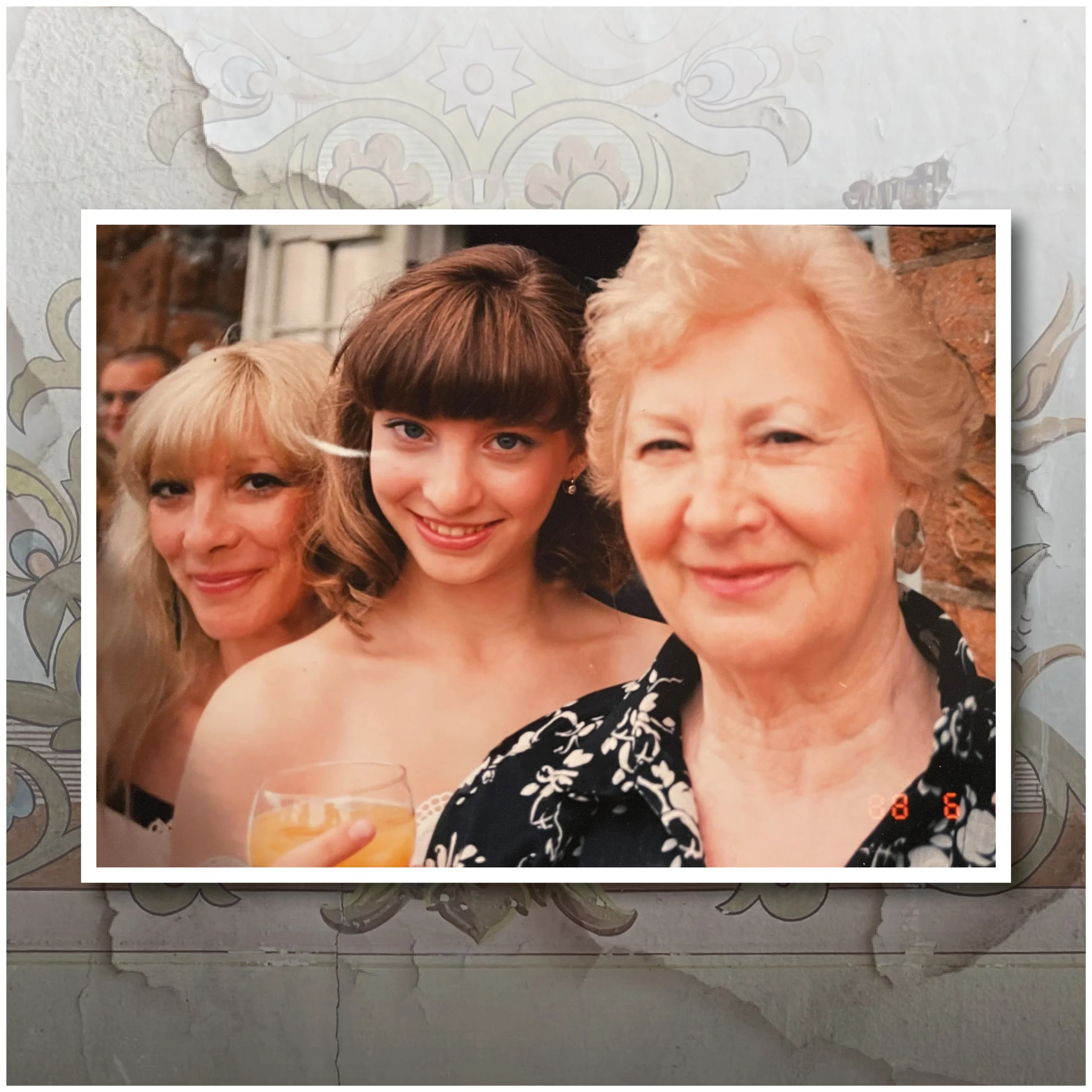
Olga, Erika & me
A story 80 years in the making…
Working with Michele this year on the six part podcast of her grandmother’s life story has been a truly fascinating process.
Each episode has been carefully crafted, through the juxtaposition of stories both past and present - while also trying to keep the narrative flowing and the listener interested. Michele has worked on episodes obsessively and I have been sometimes listening to two or three at a time to understand how they flow from one episode to the next. Most episodes have gone through many revisions, the tweaking of pauses and the alteration and rearrangement of interviews to make the flow better. It’s been quite the task, and it’s taken almost 12 months for Michele to be happy with the final cuts. It's been worth that level of detail.
When it came to the visuals, I began by looking at the photography, the old black and white photographs from pre and post war, the everyday lives in Hungary and Sweden, and the later ones taken in 80s Canada. They told a story on their own, and the types of camera used at the various periods - all showcasing a family through time.
To advertise and entice listeners to the podcast I had to think at a small scale, and think how the final image would be viewed on a phone or computer screen, so something not much larger than a postage stamp. This meant that the title, ‘Olga, Erika & me’ had to be prominent, and had to convey mystery, intrigue and drama. The key elements in drawing in listeners to a podcast they may know nothing about.
I wanted a font that had character, and at first tried three different fonts to symbolise the three different women involved. This though started to look complicated, at especially small scale, so that idea was quickly dropped for one of the fonts and an arrangement that would be pleasing to the eye, taking careful consideration into the negative spaces created by the letterforms. That came together quite quickly but something was missing, and so I started to experiment with imagery and its juxtaposition with the letters. Complicated imagery was out, and I started to settle on the 3 portraits, one of Olga in 40s black and white, Erika in 80s kodachrome colour, and one of Michele in 2020s colour. Each having a distinctive character.
Unfortunately while the portrait photographs worked on one level, at a small scale and when used with the font they became too small and quite complicated to understand quickly. Which is what I wanted the listener to understand. The background image of wallpaper was taken from an old abandoned synagogue in the town of Hajdúböszörmény, Hungary, where Olga and Erika lived post war. It had a beautiful painted motif still visible but faded on the wall and this was partly used behind the font. The rips and tears were taken from another image completely, overlaid onto the faded motif so as to convey the idea of peeling back memories, like wallpaper showing different periods of time. I liked the end result although it took about 50 versions to get the font the right opacity, the wallpaper ripped enough and the ‘&’ to be visible but not dominate the 3 names.
Each of the 6 episodes comes with its own photography.
Episode 1 introduces us to Olga through the striking use of a great black and white photograph.
Episode 2 shows the inside of one of the wooden barracks at Auschwitz Camp taken in June this year when we visited Poland.
Episode 3 introduces Jutka and Magda with Michele during her last visit to interview the both of them in Israel.
Episode 4 is a war photograph showing Olga, Magda and the two other survivors wearing home made clothes from curtains and sheets.
Episode 5 is a wedding photograph of Olga and Aron married in 1945.
Episode 6 finishes on Olga, Erika and Michele in Montreal 1985 - a pivotal year for all involved.
Episode 1 - What a Dirty Lie
Episode 2 - The Glass Heeled Shoes
Episode 3 - Dominoes
Episode 4 - Liberation
Episode 5 - Home
Episode 6 - Que Sera Sera


